Addio is a digital filing cabinet where everything regarding your life's legacy is securely stored and organized. They make it easy to prepare your most important assets, giving your family a clear path to moving forward.

The primary business needs:

1. Brand identity

2. Design system development
CASE STUDY DETAILS
Project: Addio

My contribution: wireframing, user flows, brand exploration, design system development, brand guidelines, UI/UX design

Team: 2 designers

Timeline: 4-6 weeks

Website:https://www.ouraddio.com/
The process
A CLEAR PLAN
End-of-life planning isn't something we often talk about in depth and certainly isn't a subject that gets people excited about a new product. Addio, or farewell in Italian, gives you and your family an opportunity to communicate clearly about what is needed if the unexpected happens.

Reaching Addio's target market requires a slight threading of a needle. If the brand is too fun, it may play as disrespectful or as making light of a heavy situation - but if the brand is too serious and/or middle-of-the-road, you run the risk falling in the wrong category and not breaking the mold enough to gain attention.

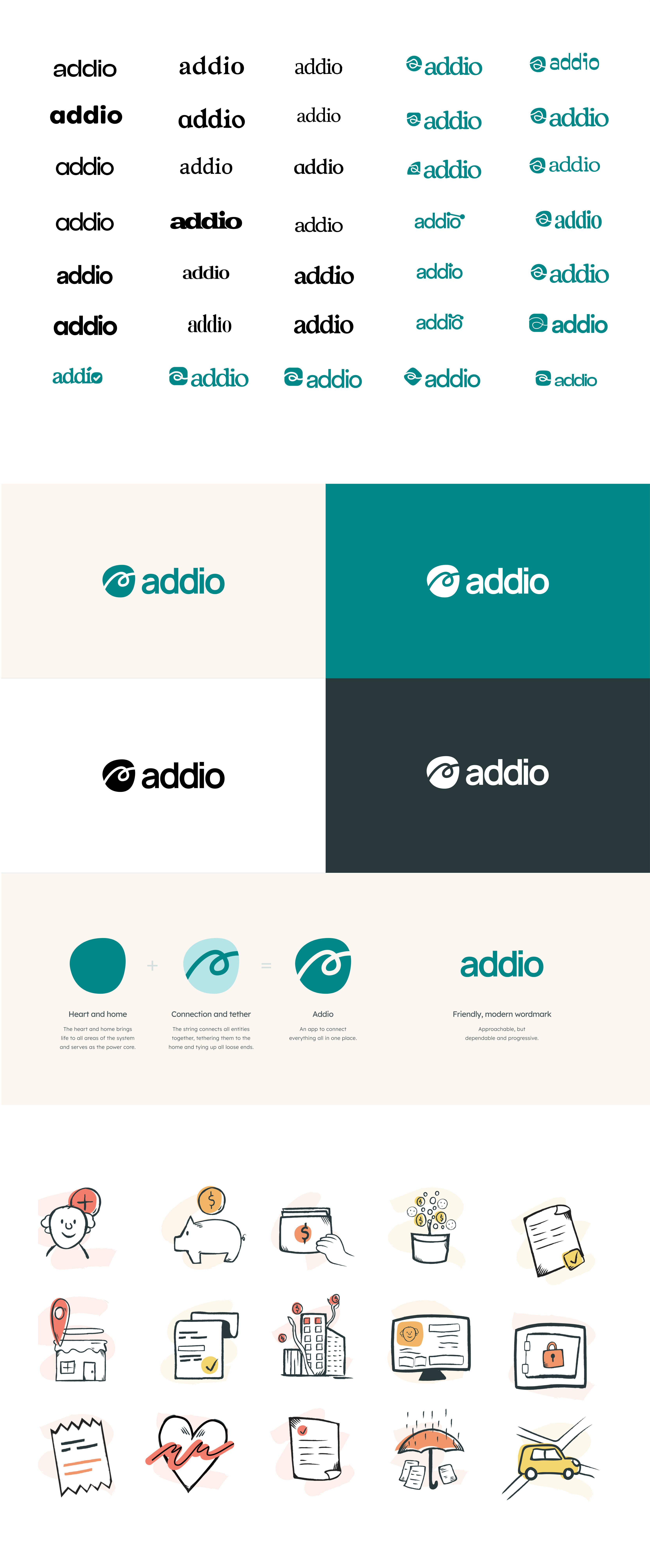
With Addio's brand identity, we wanted to communicate a friendly but respectable brand that you would feel comfortable taking care of your assets and planning.

Fonts were chosen to be highly readable for body, CTAs, and content while retaining a bit of footloose in the headline font. The summer colors help to add light to what may be a dark time, while the illustrations add a thought-provoking break from the monotony of asset management.
THE BEGINNING OF FAREWELL
Addio's platform needed to hit on a few key goals: An all-in-one solution that was easy and quick to get started with while enabling users to continually add/edit resources from time to time. Addio would need to serve as a living platform.

"Home" plays an interesting, almost dual role in our lives. It's both where we feel the most comfortable and centered, yet it's also where most of our lives happen - even if we don't immediately think so.

We wanted Addio's dashboard, or home, to give you the best snapshot of your plan. Here is where you could see recent assets, farewell items, successors, and family members - as well as your overall account progress and suggested actions. If you only ever checked in on your plan through the Dashboard, you'd still have a pretty comprehensive picture of how you're doing.

From there, the user should notice the same components and patterns repeated throughout the platform, as assets and tasks and contacts work in an atomic system as molecules to build functioning organisms.
MARKETING
We wanted the marketing for Addio to feel a bit outside of what other platforms were doing. No more stuffy or over-sentimental or highly technical verbiage with stock photography of families. We wanted to represent the Addio brand in all its quirks and charm and bring something a little different to the market.

A great product requires great marketing. We felt that we had built a pretty nice looking product that was easy-to-use, so we wanted to highlight that as much as possible in the marketing materials.

Some brands hide behind big promises and clever marketing, only to fall short with the actual experience of their product. Not Addio.

We explored the Addio color palette a bit more and pushed the illustrations more front and center - the end result was eccentric and interesting and memorable.